Inputs
A custom feature's inputs are the values it declares in Feature.with({ … }). Each entry is one row of its dialog, in the order they are listed. A value is either typed in (type: a length, a whole number, a choice, a toggle, a text) or picked in the viewport (picker: a face, an edge, an axis, a connector, …).
Two fields of an entry do different jobs:
- What the value is (
typeorpicker, and its limits) decides whatbuildTool()gets and what the statement writes. - How its row looks (
display,suffix,hint, the layout) is presentation only. Two features that differ only in looks write the same statement.
The page follows two features. A vent grid cuts rows of round holes into a panel: numbers, a checkbox, picture cards and a laid-out dialog. A fastener hole shows choices that depend on each other, a grid of pictures and a pick of several kinds.
The vent grid
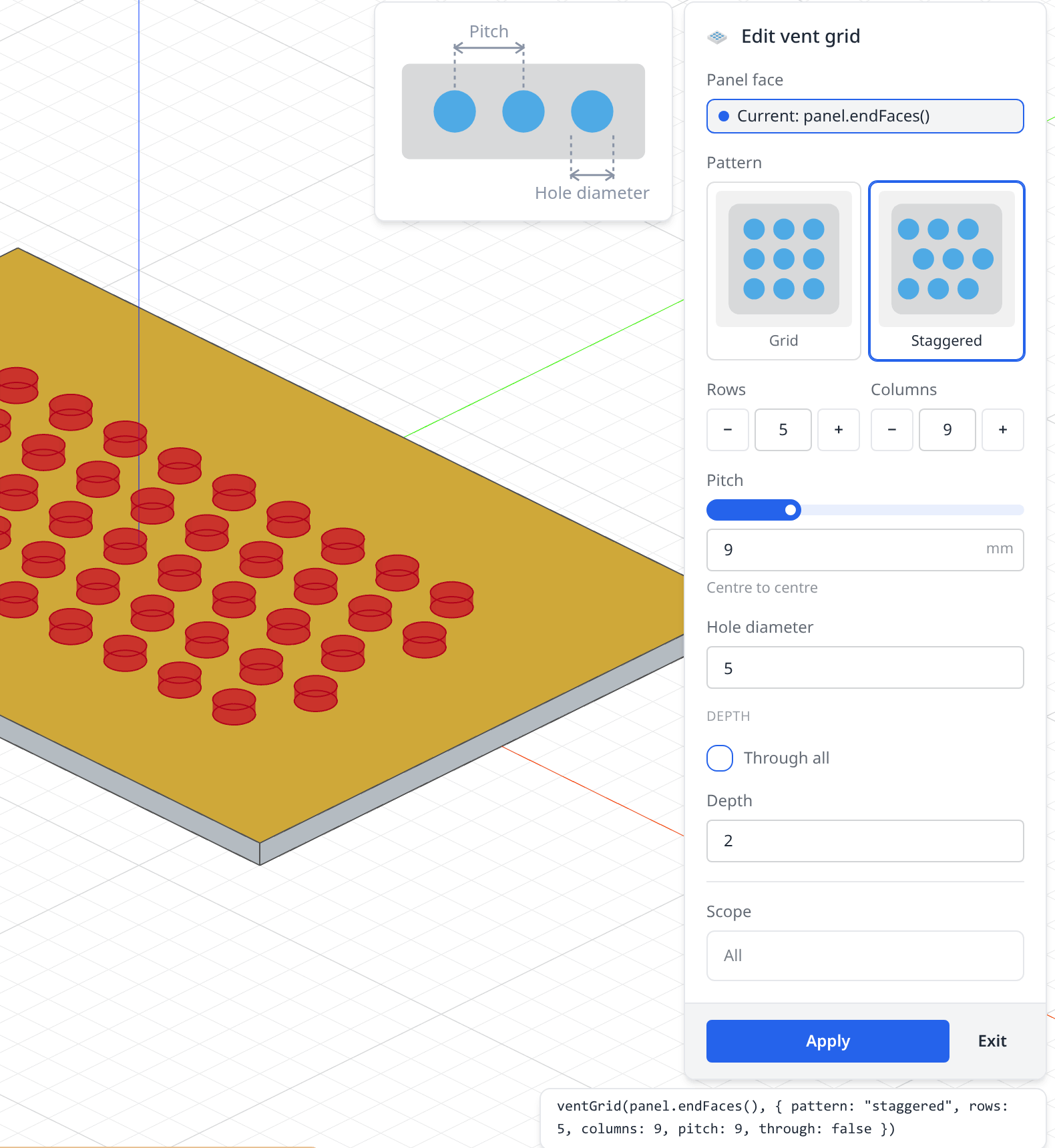
- 1Panel faceA face picker:
{ picker: 'face', surface: 'planar' }. - 2PatternA choice shown as picture cards:
{ type: 'radio', display: 'cards' }. - 3Rows and ColumnsTwo whole numbers with − / + buttons, side by side:
display: 'stepper'in a layoutrow. - 4PitchA length on a slider, with a unit and a line of help:
display: 'slider',suffix,hint. - 5Hole diameterA plain length.
- 6DepthA section holding a checkbox, and a row shown only while the checkbox is off (
visibleWhen). - 7The drawing beside the dialogAn image the dialog shows beside its rows: the feature's
aside. - 8The statementWhat Apply writes: the pick, and only the values changed from their defaults.
Its inputs, as the feature declares them:
export class VentGrid extends Feature.with({
  face: { picker: 'face', label: 'Panel face', surface: 'planar' },
  pattern: {
    type: 'radio',
    display: 'cards',
    columns: 2,
    options: [
      { label: 'Grid', value: 'grid', image: './vent-grid/grid.svg' },
      { label: 'Staggered', value: 'staggered', image: './vent-grid/staggered.svg' },
    ],
  },
  rows: { type: 'integer', display: 'stepper', default: 4, min: 1, max: 40 },
  columns: { type: 'integer', display: 'stepper', default: 6, min: 1, max: 40 },
  pitch: { type: 'length', display: 'slider', default: 8, min: 2, max: 30, suffix: 'mm', hint: 'Centre to centre' },
  diameter: { type: 'length', label: 'Hole diameter', default: 5, min: 0.5 },
  through: { type: 'boolean', display: 'checkbox', label: 'Through all', default: true },
  depth: { type: 'length', default: 2, min: 0.1, visibleWhen: { through: false } },
}) {
The whole vent grid
// A grid of round vent holes cut into a panel, centred on a planar face.
import { Feature, defineFeature } from 'fluidcad/sdk';
import { Primitives, ShapeOps } from 'fluidcad/sdk/kernel';
import { Matrix4, Plane } from 'fluidcad/math';

/** Long enough to cut through any panel. */
const THROUGH = 1000;

export class VentGrid extends Feature.with({
  // A pick: one planar face, clicked in the viewport.
  face: { picker: 'face', label: 'Panel face', surface: 'planar' },
  // A choice shown as two picture cards.
  pattern: {
    type: 'radio',
    display: 'cards',
    columns: 2,
    options: [
      { label: 'Grid', value: 'grid', image: './vent-grid/grid.svg' },
      { label: 'Staggered', value: 'staggered', image: './vent-grid/staggered.svg' },
    ],
  },
  // Whole numbers with − / + buttons, kept between min and max.
  rows: { type: 'integer', display: 'stepper', default: 4, min: 1, max: 40 },
  columns: { type: 'integer', display: 'stepper', default: 6, min: 1, max: 40 },
  // A length on a slider, with its unit and a line of help under it.
  pitch: { type: 'length', display: 'slider', default: 8, min: 2, max: 30, suffix: 'mm', hint: 'Centre to centre' },
  diameter: { type: 'length', label: 'Hole diameter', default: 5, min: 0.5 },
  // A checkbox, and a row that shows only while it is off.
  through: { type: 'boolean', display: 'checkbox', label: 'Through all', default: true },
  depth: { type: 'length', default: 2, min: 0.1, visibleWhen: { through: false } },
}) {
  static id = 'ventGrid';

  buildTool() {
    const { pattern, rows, columns, pitch, diameter, through, depth } = this.values;
    if (!(diameter < pitch)) {
      throw new Error(`vent grid: the holes (${diameter}) must be narrower than the pitch (${pitch})`);
    }
    const faces = this.facesOf(this.values.face);
    if (faces.length !== 1) {
      throw new Error(`vent grid: pick one planar face (got ${faces.length} faces)`);
    }
    const plane = faces[0].getPlane();
    const origin = plane.projectPoint(faces[0].center());
    const frame = Matrix4.fromBasis(plane.xDirection, plane.yDirection, plane.normal, origin);
    const length = through ? THROUGH : depth;

    // One cylinder per hole, laid out on the XY plane round the origin and
    // sunk below z = 0, then placed on the face: one statement, one row.
    const tools = [];
    for (let row = 0; row < rows; row++) {
      // A staggered grid shifts every other row by half a pitch, both ways
      // from the centre so the whole grid stays centred.
      const shift = pattern === 'staggered' ? (row % 2 === 0 ? -pitch / 4 : pitch / 4) : 0;
      for (let column = 0; column < columns; column++) {
        const x = (column - (columns - 1) / 2) * pitch + shift;
        const y = (row - (rows - 1) / 2) * pitch;
        const hole = Primitives.makeCylinder(diameter / 2, length);
        tools.push(ShapeOps.transform(hole, frame.multiply(Matrix4.fromTranslation(x, y, -length))));
        hole.dispose();
      }
    }

    // The holes start on the face and grow into the panel: their rims on the
    // face become the feature's start edges, so grid.startEdges() chamfers them.
    this.setBuckets({ startPlane: new Plane(origin, plane.xDirection, plane.normal.negate()) });
    return tools;
  }
}

export const ventGrid = defineFeature(VentGrid, {
  label: 'Vent grid',
  description: 'A grid of round vent holes cut into a panel',
  icon: './vent-grid.svg',
  group: 'create',
  // It only cuts: no Add / New tabs, and no .remove() to write.
  operations: ['remove'],
  // The preview is cheap to build: draw it from the start, with no toggle.
  ghost: 'always',
  call: ['face', { pattern: 'pattern', rows: 'rows', columns: 'columns', pitch: 'pitch', diameter: 'diameter', through: 'through', depth: 'depth' }],
  // Rows and columns side by side, the depth rows under a heading, and a
  // drawing of what the pitch and the diameter measure beside the dialog.
  width: 'wide',
  layout: [
    'face',
    'pattern',
    { row: ['rows', 'columns'] },
    'pitch',
    'diameter',
    { section: 'Depth', items: ['through', 'depth'] },
  ],
  aside: [{ image: './vent-grid/dims.svg', alt: 'The pitch, centre to centre, and the hole diameter' }],
});
A lid that uses it
import { part, sketch, line, extrude, chamfer } from "fluidcad/core";
import { coincident, horizontal, vertical, distance, fix } from "fluidcad/constraints";
import { ventGrid } from "./vent-grid.feature.js";

// A 120 × 80 × 3 enclosure lid with a staggered vent grid in the middle.
export const lid = part("Lid", () => {
  sketch("xy", () => {
    const b = line([-61, -41], [59, -39]);
    const r = line([59, -39], [61, 41]);
    const t = line([61, 41], [-59, 39]);
    const l = line([-59, 39], [-61, -41]);
    coincident(b.end(), r.start());
    coincident(r.end(), t.start());
    coincident(t.end(), l.start());
    coincident(l.end(), b.start());
    horizontal(b);
    vertical(r);
    horizontal(t);
    vertical(l);
    fix(b.start(), [-60, -40]);
    distance(b.start(), b.end(), 120);
    distance(r.start(), r.end(), 80);
  });
  const panel = extrude(3);

  // 5 rows of 9 holes, every other row shifted half a pitch.
  const grid = ventGrid(panel.endFaces(), { pattern: "staggered", rows: 5, columns: 9, pitch: 9 });
  // The rims the holes left on the top face: the feature's start edges.
  chamfer(0.5, grid.startEdges());
});
Fields every input takes
| Field | Meaning |
|---|---|
label | The row's caption. Without one, the name made readable: holeDiameter reads Hole diameter. |
description | The row's tooltip. |
hint | A line of small text under the row, always on show: Centre to centre. |
default | What a row left alone holds, and what a call that leaves the value out gets. Pickers take none: their value is what the user picks. |
defaults | Defaults that follow other values: [{ when: { type: 'wall' }, value: 720 }]. See Defaults that follow another value. |
optional | The call may leave the value out. Without a default, the feature then gets undefined. |
visibleWhen | When the row shows. See Rows that show only when they matter. |
group, tab | A heading or a tab the row sits under: the short way to lay out a dialog. |
aside | A drawing the dialog shows beside its rows while this row has the focus. See A drawing per row. |
A misspelt field is refused where the file loads, naming the fields the input takes: unknown field 'defualt' for a length value — its fields are …. The feature is greyed in the Custom dropdown until it is fixed.
Numbers
type | The feature gets | Notes |
|---|---|---|
length | a number | In the model file's unit. A default is a plain number in that unit. |
angle | a number | In degrees. The label reads Start angle (°). |
integer | a whole number | A call that passes 2.5 fails to compile. |
number | a number | Anything else: a ratio, a count of turns. |
min and max bound the value. A model whose call passes a value outside them fails to compile at that call, naming the value and the bound. How the row looks:
| Field | Row |
|---|---|
| (none) | A plain input. It takes expressions and the part's variables, as the built-in dialogs do: pitch * 2, wallThickness. |
display: 'slider' | A track above the input, for a value worth exploring. Needs min and max. step sets the track's step: 1 for an integer, else a hundredth of the range. |
display: 'stepper' | − and + buttons beside the input, stepping by step (1 without one). For a number or an integer, not a length or an angle. |
suffix: 'mm' | A short unit at the end of the input, up to 8 characters. On an angle it replaces the (°). |
// A bolt circle's inputs: a count, a diameter and a starting angle.
count: { type: 'integer', label: 'Holes', display: 'stepper', default: 4, min: 1, max: 36 },
circle: { type: 'length', label: 'Circle diameter', default: 32, min: 0 },
start: { type: 'angle', label: 'Start angle', default: 45 },
Give every size a sensible default. A number row with no default starts empty, and the dialog won't apply until it is filled: Height is required.
Toggles
through: { type: 'boolean', display: 'checkbox', label: 'Through all', default: true },
A boolean is a switch, or a checkbox with display: 'checkbox'. Without a default it is off, and the feature gets false.
Choices
A choice offers a list of options. Each option has a label the dialog shows and a value, a string or a number, which is what the feature gets and the statement writes. With no default, the choice starts at its first option.
| Field of an option | Meaning |
|---|---|
label, value | What the dialog shows, and what the feature gets. Required. |
image | A picture of the option, next to the feature file: './vent-grid/grid.svg'. See Pictures. |
description | A line under the label. |
group | A heading the option is listed under. |
keywords | More words a search finds it by: ['inch'] for the imperial sizes. |
when | The other values it is offered for. See Options that follow another value. |
A few choices, all on show: radio
A radio shows every option at once. Choose it for two to five choices the user should see together:
display | Row |
|---|---|
'list' | Stacked, one per line. The default. |
'inline' | On one line. |
'buttons' | A segmented row of buttons, for two or three short labels: Metric / Imperial. |
'cards' | Picture tiles, for choices told apart by their shape: Grid / Staggered. columns sets 2 to 6 per line. |
standard: {
  type: 'radio',
  display: 'buttons',
  options: [{ label: 'Metric', value: 'iso' }, { label: 'Imperial', value: 'unc' }],
},
Many choices: select
A select is a dropdown. With display: 'grid', the dropdown opens on a grid of the options' pictures (columns, 2 to 6). search: true adds a search box that matches labels, descriptions and keywords. Reach for it beyond a dozen options.
size: {
  type: 'select',
  label: 'Screw',
  default: 'm3',
  display: 'grid',
  columns: 3,
  search: true,
  options: [
    { label: 'M3', value: 'm3', image: './fastener/m3.svg', description: '3.4 mm clearance' },
    { label: 'M4', value: 'm4', image: './fastener/m4.svg', description: '4.5 mm clearance' },
    { label: 'M5', value: 'm5', image: './fastener/m5.svg', description: '5.5 mm clearance' },
  ],
},
A select is also the choice a parameter can drive. Buttons and cards can't take one.
Options that follow another value
An option's when names the other values it is offered for. The fastener hole's screws follow its standard: the metric sizes for Metric, the numbered sizes for Imperial.
size: {
  type: 'select',
  label: 'Screw',
  default: 'm3',
  display: 'grid',
  columns: 3,
  search: true,
  options: [
    { label: 'M3', value: 'm3', image: './fastener/m3.svg', when: { standard: 'iso' } },
    { label: 'M4', value: 'm4', image: './fastener/m4.svg', when: { standard: 'iso' } },
    { label: 'M5', value: 'm5', image: './fastener/m5.svg', when: { standard: 'iso' } },
    { label: '#4', value: 'n4', image: './fastener/n4.svg', when: { standard: 'unc' }, keywords: ['inch'] },
    { label: '#6', value: 'n6', image: './fastener/n6.svg', when: { standard: 'unc' }, keywords: ['inch'] },
  ],
},
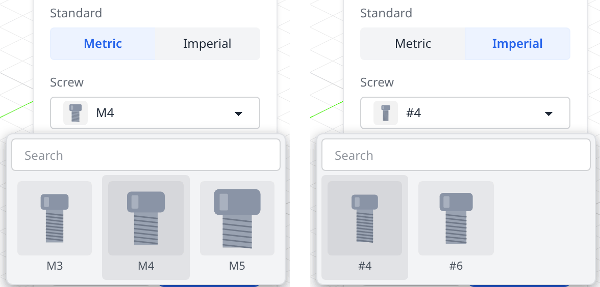
- Switching to Imperial moves the screw from M4, no longer offered, to #4, the first one that is. The statement writes
standard: 'unc', size: 'n4'. whentakes one value or a list ({ standard: ['iso', 'din'] }). Every value it names must match.- For a table of sizes, where one option comes with several combinations,
whentakes a list of such objects, and the option is offered while any one of them matches:when: [{ shape: 'single', height: 40 }, { shape: 'double', height: [20, 80] }]. - The
defaultmust be offered while every other value is at its own default. The declaration is refused otherwise. whennarrows the dialog only. A call written by hand may pass any declared option, sobuildTool()must handle every one.
Prefer one choice whose options follow another value over two choices swapped in and out with visibleWhen.
Several at once: multiple
// The sides of an enclosure left open.
open: {
  type: 'select',
  multiple: true,
  label: 'Open sides',
  options: [
    { label: 'Front', value: 'front' },
    { label: 'Back', value: 'back' },
    { label: 'Left', value: 'left' },
    { label: 'Right', value: 'right' },
  ],
  default: [],
  max: 3,
},
A select with multiple: true holds a list of options. The dropdown shows a check mark per chosen option, and the row reads the chosen labels, N selected past two, or None. The feature always gets a list, in the order the call wrote it, [] for none: this.values.open.includes('front'). min and max count the options chosen. The statement writes an array literal: open: ['front', 'left'].
Text
// A part number kept with the feature.
marking: { type: 'text', optional: true, placeholder: 'A2-70', maxLength: 12, pattern: '[A-Za-z0-9-]*', hint: 'Letters, digits and dashes' },
A text is a string. placeholder is what the empty input shows, maxLength the most characters, and pattern a regular expression the whole text must match. A text that breaks either blocks Apply with the reason, and a call that passes one fails to compile. multiline: true gives a text of several lines: Enter starts a new line, and Ctrl/Cmd+Enter applies.
What a row left alone gives
A row left alone always builds what it shows. A call that leaves a value out gets the same thing:
| Declared | The row shows | The feature gets |
|---|---|---|
any input with a default | the default | the default |
any input with defaults | the first whose when holds, else the default — and it follows the other rows until the user changes it | the same, from the call's other values |
boolean, no default | off | false |
select or radio, no default | the first option offered | that option's value |
select or radio, no default, optional: true | nothing chosen | undefined |
select with multiple: true | the default, else None | the default, else [] |
| a slider, no default | its min | min |
| a number or a text, no default | an empty row | required: Apply says Height is required., and a call without it fails to compile |
the same, optional: true | an empty row | undefined |
The dialog writes only the values the user changed, so a statement stays short: ventGrid(panel.endFaces(), { pitch: 9 }).
Defaults that follow another value
defaults gives a value defaults that depend on the other values. A cabinet's height follows its type:
type: {
  type: 'radio', display: 'buttons', default: 'base',
  options: [{ label: 'Base', value: 'base' }, { label: 'Wall', value: 'wall' }, { label: 'Wardrobe', value: 'wardrobe' }],
},
height: {
  type: 'length', default: 900, min: 300, max: 3000,
  defaults: [
    { when: { type: 'wall' }, value: 720 },
    { when: { type: 'wardrobe' }, value: 2400 },
  ],
},
- The first entry whose
whenholds is the default. The plaindefaultapplies when none holds, so the value must have one (aboolean, aselectand aradioalways do). whenreads as an option'swhen: one value or a list ({ type: ['wall', 'wardrobe'] }), every value it names matching, or a list of such objects, any one matching.- A
whennames typed-in values only, and only values that declare nodefaultsof their own: one level, no chains. The declaration is refused otherwise, naming the entry:defaults[0]: 'when' names 'depth', which declares 'defaults' itself. - Each
valueis checked as a call's value is: its type,minandmax, one of the options. On a choice whose options carry awhen, each value must be offered where itswhenholds. - In the dialog, a row the user has not touched follows its default: pick Wall and the height shows 720. A row the user changed keeps its value.
- A call that leaves the value out gets the default its other values give it:
cabinet({ type: 'wall' })is 720 high. The dialog leaves a value set to that default out of the statement, so changing the type later still moves the height.
Rows that show only when they matter
visibleWhen shows a row only while other values hold what it names. The vent grid's depth only matters for a blind cut:
through: { type: 'boolean', display: 'checkbox', label: 'Through all', default: true },
depth: { type: 'length', default: 2, min: 0.1, visibleWhen: { through: false } },
- Every value it names must match. A value may also match one of a list:
{ size: ['m3', 'm4'] }. - When one object can't say it, give a list of objects: the row shows while any one of them holds. A cabinet's handle row shows for a wardrobe with doors, or for any base cabinet:
visibleWhen: [{ type: 'wardrobe', doors: true }, { type: 'base' }]. - A hidden row writes nothing. Its value still reaches the feature:
depthis 2 while the cut goes through, andbuildTool()decides whether to read it. - It may name a picked value, with a condition on what is picked:
picked: true, acountof picks, thesurfaceof the picked faces ('planar','cylinder','cone','sphere','torus'), ornot: { … }for the opposite.
at: { picker: ['face', 'axis'], optional: true },
// The hub's size shows unless a shaft (a cylindrical face) is picked.
hubDiameter: { type: 'length', default: 20, visibleWhen: { at: { not: { surface: 'cylinder' } } } },
Picks
A picked value is clicked in the viewport, or chosen from a History row. The dialog writes what a model would write by hand: panel.endFaces(), 'z', bolt.instance(1).
picker | The dialog takes | It writes | buildTool() reads it with |
|---|---|---|---|
face | faces | e.endFaces(), select(face()…) | facesOf() |
edge | edges; with facesAsEdges: true, a face stands for its edges | e.endEdges(0) | edgesOf() |
axis | a world axis, an axis(), a straight edge, a connector | 'z', ax, axis(e.sideEdges(0)), bolt | axisOf() |
plane | an origin plane, a plane(), a planar face | 'xy', p, plane(e.endFaces()) | planeOf() |
sketch | a sketch's outline, or its row | the sketch's variable | shapesOf() |
solid | a face or edge of a solid, or the row that made it | that statement's variable | shapesOf() |
feature | a feature's row; with types: ['hole'], a face or edge such a feature made | its variable | shapesOf(), framesOf(), propertiesOf() |
connector | a connector, or a copy of one | bolt, bolt.instance(2) | frameOf(), pointOf() |
point | a vertex: a sketch point, a solid's corner | s.geometries.a, e.endEdges(0).end() | frameOf(), pointOf() |
anchor | a face or an edge, then one of the points it suggests | e.endFaces().center() | frameOf(), pointOf() |
More fields narrow what the dialog takes:
- A list of picks:
multiple: true, ormax: 3for at most three. The feature always gets a list,[]for none.ordered: truelets the user drag the picks into order. Anaxisor aplaneis always one pick. - What kind:
surface: 'planar' | 'cylinder' | 'cone' | 'torus'on a face,curve: 'line' | 'circle' | 'arc'on an edge. The dialog refuses anything else with the reason (On face: the picked face is not planar). A call written by hand is not checked: check inbuildTool()when it matters. - A sketch:
hasGeometry: truerefuses an empty one.implicitDefault: truelets the call leave it out. - An anchor:
anchors: ['center']suggests the centres only ('center','start','end','offset').
A pick a call may leave out (optional: true) can come first and still be skipped: a call goes straight to its options, gear({ teeth: 24 }).
Several kinds in one pick
picker takes a list of kinds. The fastener hole goes in at a connector, a sketch point or the centre of a face:
at: { picker: ['connector', 'point', 'anchor'], anchors: ['center'], label: 'At' },
Each click goes to the one kind that takes it, so the kinds must take different clicks. ['face', 'edge'] and ['solid', 'connector'] work. ['face', 'anchor'] is refused, because both take a click on a face. frameOf() reads any of the three the same way, and isLocation() tells a connector, point or anchor from the other kinds.
Laying out the dialog
A dialog with a handful of rows needs no layout: the rows follow the declaration. A value's group puts it under a heading, and its tab on a tab:
count: { type: 'integer', label: 'Holes', default: 4, min: 1, tab: 'Pattern' },
circle: { type: 'length', label: 'Circle diameter', default: 32, tab: 'Pattern' },
through: { type: 'boolean', label: 'Through all', default: true, tab: 'Hole', group: 'Depth' },
depth: { type: 'length', default: 3, tab: 'Hole', group: 'Depth', visibleWhen: { through: false } },
When rows should sit side by side, fold away, or come with notes and drawings, give defineFeature() a layout. The vent grid's:
width: 'wide',
layout: [
  'face',
  'pattern',
  { row: ['rows', 'columns'] },
  'pitch',
  'diameter',
  { section: 'Depth', items: ['through', 'depth'] },
],
aside: [{ image: './vent-grid/dims.svg', alt: 'The pitch, centre to centre, and the hole diameter' }],
| Item | What it places |
|---|---|
'name' | A value's row. |
{ row: ['a', 'b'] } | Two to four typed-in values side by side. widths: [2, 1] shares the width. A picked value takes a full row. |
{ section: 'Title', items: [...] } | Rows under a heading. collapsed: true opens it folded, for rows rarely changed. |
{ tabs: [{ label, items }, …] } | Two tabs or more, at the top level, once. |
{ note: 'text' } | A line of text. tone: 'warning' marks it. |
{ image: './x.svg' } | A picture between the rows. height in pixels, 16 to 480. |
{ divider: true } | A rule between rows. |
- Every value is placed exactly once. A value left out is refused (the value 'depth' has no place in the layout), and so is a value's own
grouportab. - Every item takes a
visibleWhen. The fastener hole shows a note only for a counterbore:{ note: 'The recess is sized for the head of the screw.', visibleWhen: { head: 'counterbore' } }. width: 'wide'or'wider'opens a wider dialog.asideshows notes and pictures in a card beside the rows, here what the pitch and the diameter measure.- A row never cuts a label short: a cell that doesn't fit moves onto a line of its own. Pair narrow inputs, such as two numbers, and give buttons or a dropdown a line to themselves.
A drawing per row
A value can bring its own aside, shown in the card in place of the feature's while its row has the focus. Use it for a value the user may not know, such as a gear's module or pressure angle:
module: {
  type: 'length',
  default: 2,
  aside: [
    { image: './gear/module.svg', alt: 'The circular pitch p = π · m', height: 200 },
    { note: 'The module is the pitch diameter over the number of teeth.' },
  ],
},
The card is 200 pixels wide inside. In a narrow window, where the dialog becomes a sheet, only the feature's own aside shows.
Pictures
Icons, option pictures and dialog drawings are files next to the feature file, named by a relative path: './fastener/m4.svg', never ../ or a URL. SVG, PNG, JPEG and WebP all work. Only the files the description names are served.
They are shown as pictures, so they follow the icon rules. currentColor draws black, so use fixed colours that read in both themes: the toolbar's greys and blues, or a mid-tone grey such as #8a94a6 for line art.
| Where | Size | Draw |
|---|---|---|
Cards and a grid dropdown | A square as wide as its cell, about 80 pixels | A square picture that fills the square: a section, a pattern, a part seen from the side. |
A list option | 24 pixels | One bold shape. |
A buttons option | 16 pixels | A glyph, or no picture. |
The aside card | 200 pixels wide | A dimension drawing, with its labels. |
The pictures in the captures on this page follow these rules. The vent grid's cards are its two patterns, seen from above. The fastener's screws are drawn to one scale, so the sizes compare at a glance, and its heads are sections through the part, with the cut's walls in blue.
The fastener hole
The fastener hole cuts a screw's clearance hole, with a recess for the head when asked. The built-in Hole does this and more: the fastener is here for its dialog. Buttons pick the standard, a grid of pictures the screw, cards the head, and a slider the depth. A note shows for a counterbore.
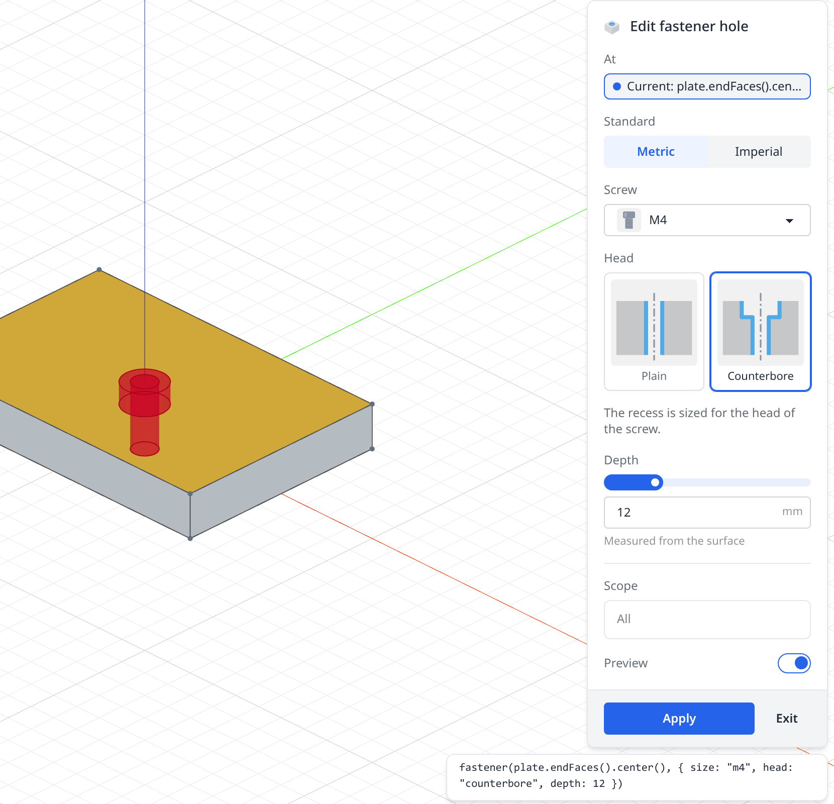
The whole fastener hole
// A clearance hole for a screw, sunk into the material at a connector, a point
// or the centre of a face, with a recess for the screw's head.
import { Feature, defineFeature } from 'fluidcad/sdk';
import { Primitives, ShapeOps } from 'fluidcad/sdk/kernel';
import { Matrix4 } from 'fluidcad/math';

/** Each screw's clearance hole, head diameter and head height, in mm. */
const SCREWS = {
  m3: { clearance: 3.4, head: 6.5, headHeight: 3 },
  m4: { clearance: 4.5, head: 8, headHeight: 4 },
  m5: { clearance: 5.5, head: 10, headHeight: 5 },
  n4: { clearance: 3.3, head: 6, headHeight: 2.8 },
  n6: { clearance: 3.9, head: 7.5, headHeight: 3.5 },
};

export class Fastener extends Feature.with({
  // A pick of three kinds: a connector, a sketch point or the centre of a face.
  at: { picker: ['connector', 'point', 'anchor'], anchors: ['center'], label: 'At' },
  // Two short choices, side by side as buttons.
  standard: {
    type: 'radio',
    display: 'buttons',
    options: [{ label: 'Metric', value: 'iso' }, { label: 'Imperial', value: 'unc' }],
  },
  // Many choices told apart by their shape: a grid of pictures, searchable,
  // offering only the screws of the standard chosen above (`when`).
  size: {
    type: 'select',
    label: 'Screw',
    default: 'm3',
    display: 'grid',
    columns: 3,
    search: true,
    options: [
      { label: 'M3', value: 'm3', image: './fastener/m3.svg', description: '3.4 mm clearance', when: { standard: 'iso' } },
      { label: 'M4', value: 'm4', image: './fastener/m4.svg', description: '4.5 mm clearance', when: { standard: 'iso' } },
      { label: 'M5', value: 'm5', image: './fastener/m5.svg', description: '5.5 mm clearance', when: { standard: 'iso' } },
      { label: '#4', value: 'n4', image: './fastener/n4.svg', description: '3.3 mm clearance', when: { standard: 'unc' }, keywords: ['inch'] },
      { label: '#6', value: 'n6', image: './fastener/n6.svg', description: '3.9 mm clearance', when: { standard: 'unc' }, keywords: ['inch'] },
    ],
  },
  // A few choices, all worth seeing at once: picture cards.
  head: {
    type: 'radio',
    display: 'cards',
    columns: 2,
    options: [
      { label: 'Plain', value: 'plain', image: './fastener/plain.svg', description: 'Nothing for the head' },
      { label: 'Counterbore', value: 'counterbore', image: './fastener/counterbore.svg', description: 'A recess the head sinks into' },
    ],
  },
  depth: { type: 'length', default: 10, min: 1, max: 50, display: 'slider', suffix: 'mm', hint: 'Measured from the surface' },
}) {
  static id = 'fastener';

  buildTool() {
    const { size, head, depth } = this.values;
    const screw = SCREWS[size];
    const recess = head === 'counterbore' ? screw.headHeight : 0;
    if (!(depth > recess)) {
      throw new Error(`fastener: the hole (${depth}) must be deeper than the recess for its head (${recess})`);
    }
    // Where the screw goes in: origin on the surface, Z out of the material.
    const frame = this.frameOf(this.values.at);
    const place = Matrix4.fromBasis(frame.xDirection, frame.yDirection, frame.normal, frame.origin);

    // Each cylinder stands on the XY plane; sink it below z = 0, then place it.
    /** @param {number} radius @param {number} length */
    const sunk = (radius, length) => {
      const cylinder = Primitives.makeCylinder(radius, length);
      const placed = ShapeOps.transform(cylinder, place.multiply(Matrix4.fromTranslation(0, 0, -length)));
      cylinder.dispose();
      return placed;
    };
    const tools = [sunk(screw.clearance / 2, depth)];
    if (recess > 0) {
      tools.push(sunk(screw.head / 2, recess));
    }
    return tools;
  }
}

export const fastener = defineFeature(Fastener, {
  label: 'Fastener hole',
  description: 'A screw clearance hole, plain or counterbored',
  icon: './fastener.svg',
  group: 'create',
  operations: ['remove'],
  call: ['at', { standard: 'standard', size: 'size', head: 'head', depth: 'depth' }],
  layout: [
    'at',
    'standard',
    'size',
    'head',
    { note: 'The recess is sized for the head of the screw.', visibleWhen: { head: 'counterbore' } },
    'depth',
  ],
});
A cover plate that uses it
import { part, sketch, line, extrude } from "fluidcad/core";
import { coincident, horizontal, vertical, distance, fix } from "fluidcad/constraints";
import { fastener } from "./fastener.feature.js";

// A 60 × 40 × 8 cover plate with a counterbored M4 hole at its centre.
export const cover = part("Cover plate", () => {
  sketch("xy", () => {
    const b = line([-31, -21], [29, -19]);
    const r = line([29, -19], [31, 21]);
    const t = line([31, 21], [-29, 19]);
    const l = line([-29, 19], [-31, -21]);
    coincident(b.end(), r.start());
    coincident(r.end(), t.start());
    coincident(t.end(), l.start());
    coincident(l.end(), b.start());
    horizontal(b);
    vertical(r);
    horizontal(t);
    vertical(l);
    fix(b.start(), [-30, -20]);
    distance(b.start(), b.end(), 60);
    distance(r.start(), r.end(), 40);
  });
  const plate = extrude(8);

  // At the centre of the top face; 12 deep cuts right through the 8 mm plate.
  fastener(plate.endFaces().center(), { size: "m4", head: "counterbore", depth: 12 });
});
The call
call in defineFeature() maps a model's arguments to the inputs. In order:
- Values passed by position:
'face'. - At most one object of options, each key naming a value:
{ rows: 'rows', pitch: 'pitch' }. A key may differ from the value's name:{ dia: 'diameter' }. - At most one rest value, a list of picks spread over the last arguments:
'...faces'.
call | A model writes |
|---|---|
['face', { height: 'height', outer: 'outer', hole: 'hole' }] | standoff(pad.endFaces(), { height: 12 }) |
['around', { count: 'count', circle: 'circle' }] | boltCircle('z', { count: 6 }) |
['at', { teeth: 'teeth' }], with at optional | gear(seat.endFaces(), { teeth: 14 }), gear({ teeth: 24 }), gear() |
['angle', '...faces'] | draft(5, e.sideFaces(), e2.sideFaces()) |
- Every value appears in
callexactly once. - Follow the built-ins: what is picked comes first, by position, and sizes go in the object of options.
- A call that doesn't fit fails to compile, naming the fix:
standoff(): unknown option 'hieght' — the options are 'height', 'outer' and 'hole'. In the editor the arguments are typed, so the misspelt option is marked as you write. - The dialog edits a statement whose options are written as an object literal, with choices and texts as plain literals. A statement written another way still runs, but its History row opens as not editable: options held in a variable (
{ ...size }), or a choice given as an expression (size: screw).